Tag Archives: Mobile First


Mobile Responsive Web Design: The Strategic Guide for Business Growth in 2026

Mobile Responsive Web Design: The Strategic Guide for Business Growth in 2026

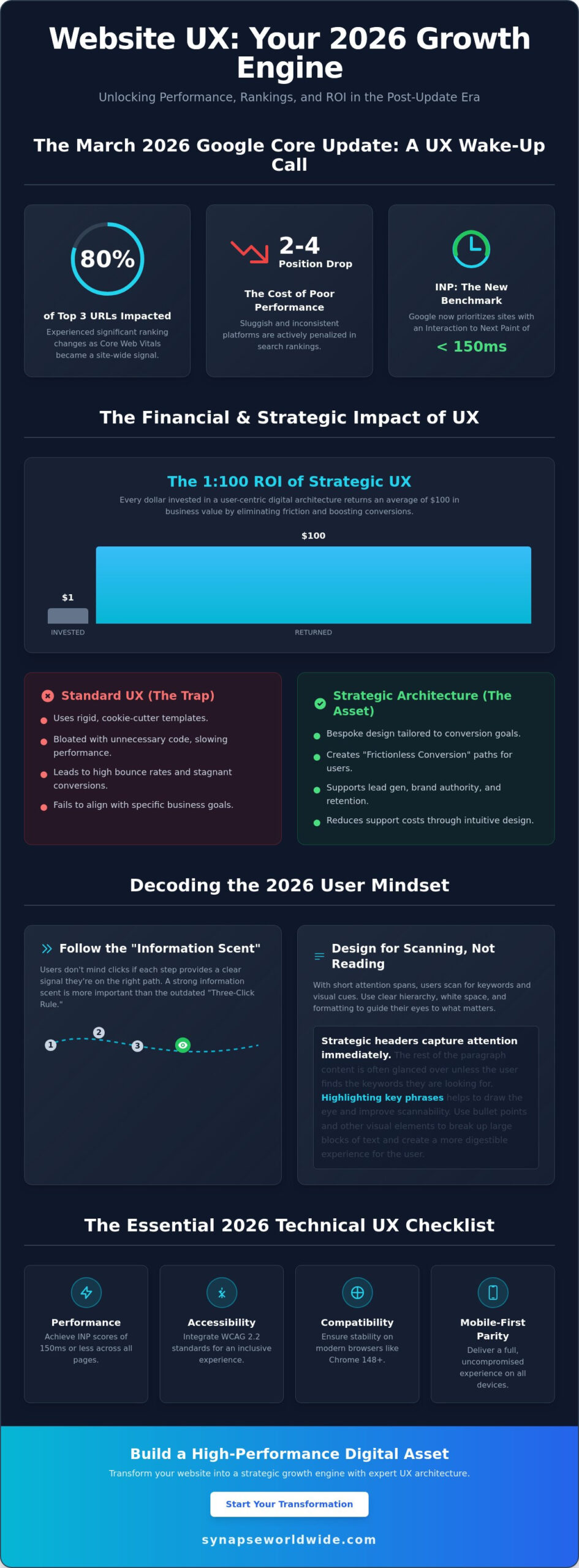
As of July 1, 2026, Google will entirely remove websites from its index if they lack a functional mobile version. This isn’t a mere ranking penalty; it’s a total exclusion from the digital marketplace. You likely recognize the urgency as mobile devices now command 52.8% of all global web traffic. It’s exhausting to watch high bounce rates climb while your competitors capture the smartphone audience you’ve worked hard to build. You need a digital foundation rooted in mobile responsive web design that commands respect on every screen size without getting lost in technical jargon.

Implementing a sophisticated mobile responsive web design transforms your digital infrastructure into a high-performance engine for user engagement and conversion. This guide provides the strategic roadmap to align your site with the CSS Snapshot 2026 standards and Google’s strict indexing requirements. We’ll explore how to optimize Core Web Vitals, ensure content parity, and reduce mobile cart abandonment rates that currently peak at 85.65% for many industries. You’ll gain the clarity needed to turn your website into a reliable asset for long-term business growth and reach the next level of digital success.

Key Takeaways

  • Adopt the “one site, every device” philosophy to streamline your digital presence. It’s the most efficient way to ensure a consistent brand experience across all platforms.
  • Discover how mobile responsive web design directly influences your SEO visibility and keeps bounce rates low.
  • Identify the critical differences between responsive, adaptive, and mobile-friendly layouts to avoid costly development mistakes.
  • Learn to use fluid grids and flexible images to maintain high-performance load speeds on any connection.
  • Implement a mobile-first strategy by auditing your performance and refining your content hierarchy for maximum conversion.

What is Mobile Responsive Web Design?

At its core, mobile responsive web design is an architectural approach where a single digital infrastructure adapts its layout, content, and functionality to any screen size. This “One Site, Every Device” philosophy eliminates the need for redundant subdomains or separate mobile applications. It ensures your brand maintains a singular, authoritative presence across the web. In 2026, this strategy is no longer optional. Google’s recent policy shift mandates that as of July 1, 2026, any website lacking a functional mobile version will be entirely excluded from search results. This makes responsiveness the primary gatekeeper for your business’s online visibility.

Modern standards defined by the CSS Snapshot 2026 require more than just making elements “fit” on a screen. High-performance design now integrates the viewport meta tag to instruct browsers on how to scale content correctly. This technical directive allows your site to render accurately across the diverse resolutions of 2026, from foldable devices to high-definition desktop monitors. By prioritizing this foundational layer, you protect your search rankings and provide a stable platform for growth.

The Evolution from Desktop-First to Mobile-First

The digital landscape has moved far beyond the era of “m.” sites. These separate mobile versions often failed because they lacked content parity and created fragmented user experiences. Australian businesses that once viewed mobile as a secondary concern now face a reality where 52.8% of global traffic originates from handheld devices. Users in 2026 demand desktop-level functionality on their smartphones. They expect fast load times and full access to every feature, making a unified Responsive Web Design (RWD) strategy essential for retaining high-value leads.

Core Characteristics of Responsive Architecture

Implementing a professional mobile responsive web design involves three pillars that ensure your digital presence is both flexible and resilient. These components work together to provide a seamless experience regardless of the hardware used by your visitors.

  • Fluidity: Content must act like water, flowing naturally into different container sizes without breaking the layout or requiring horizontal scrolling.
  • Intelligent Reflow: This involves more than just shrinking images. It requires a strategic reordering of elements so that the most critical business information remains at the top of the visual hierarchy on smaller screens.
  • Touch-Ready Interfaces: Mouse cursors are precise, but thumbs are not. Modern architecture prioritizes larger tap targets and intuitive gestures to accommodate the tactile nature of mobile browsing.

The Strategic Business Value of Responsive Design

Investing in mobile responsive web design is a high-level strategic decision that directly impacts your bottom line. It’s not merely a technical requirement; it’s a commitment to your digital infrastructure’s performance and reliability. By ensuring your site functions flawlessly across all devices, you eliminate the friction that causes potential clients to abandon their journey. A cohesive mobile experience builds immediate brand trust, positioning your business as a sophisticated and capable partner in an increasingly competitive global market. Using a single URL for all marketing campaigns also streamlines your tracking and management, ensuring your custom web design for small business delivers a consistent message regardless of how it’s accessed.

SEO and the Mobile-First Indexing Era

Google’s evaluation of your digital presence is now entirely dependent on your mobile version. Since mobile-first indexing is the absolute standard in 2026, Google treats your smartphone-optimized site as the primary version for ranking and indexing. This shift means that poor mobile performance will degrade your visibility even for desktop searches. To maintain a competitive edge, your site must excel in Core Web Vitals, specifically targeting metrics like Interaction to Next Paint (INP) and Largest Contentful Paint (LCP). A robust mobile responsive web design provides the stable foundation necessary for a successful SEO architecture. By Implementing a Mobile-First Strategy, you ensure that search engines can crawl and index your content with maximum efficiency.

Conversion Rate Optimization (CRO) on Mobile

There is a significant performance gap between mobile and desktop conversion rates that businesses must bridge. Statistics from April 2026 show mobile conversion rates averaging around 1.82%, compared to 3.14% on desktop. This discrepancy is often due to checkout friction and poor layout hierarchy. High mobile cart abandonment rates, which reached 85.65% in early 2026, are frequently the result of non-responsive elements that frustrate users. Responsive architecture solves this by prioritizing essential content and simplifying the path to purchase. When elements stack and reorder intelligently, you guide the user toward a conversion with minimal effort. This results-oriented approach transforms your website from a static brochure into a proactive lead-generation tool. If you’re looking to capture this lost revenue, our team can help you build a high-performance Custom Web Design solution tailored to your growth objectives.

Mobile Responsive Web Design: The Strategic Guide for Business Growth in 2026

Key Components: Fluid Grids, Flexible Images, and Media Queries

Building a resilient mobile responsive web design requires a shift from rigid, fixed-pixel layouts to a fluid architectural framework. In the past, designers built for a standard 1920×1080 desktop resolution. Today, your site must accommodate a fragmented landscape of devices, including the 11.28% of mobile users on 1080×2400 displays. Fluid grids achieve this by using proportional percentages rather than fixed units. This ensures that every element on the page scales harmoniously, preventing the awkward horizontal scrolling that drives users away. It’s about creating a container that adjusts to the user’s environment rather than forcing the user to adapt to your design.

Media queries act as the strategic brain of your website. These instructions, defined by the CSS Snapshot 2026, detect the user’s device capabilities and apply specific styling rules accordingly. By setting precise breakpoints, you create a seamless transition between a large desktop monitor and a handheld smartphone. This technical precision ensures that your brand’s digital presence remains professional and functional, regardless of the hardware your client chooses to use. It’s a disciplined approach that guarantees your content is always presented in its most readable and accessible format.

Modern Layout Tools: Flexbox and CSS Grid

The arrival of advanced CSS modules has revolutionized how we structure digital content. Flexbox is the ideal tool for one-dimensional layouts, such as navigation bars and centered call-to-action buttons. For more complex, two-dimensional page architectures, CSS Grid provides the discipline needed to manage intricate layouts without sacrificing speed. These tools are essential for meeting website UX best practices, as they allow for content to be reordered based on priority. On a smartphone, your most important lead-generation elements should always be the first things a user sees.

Optimising Media for Performance

Flexible images are a non-negotiable component of high-performance mobile responsive web design. Using the “srcset” attribute allows your site to serve the most appropriate image size for the user’s specific screen. This prevents mobile users from wasting data on high-resolution assets meant for 5K monitors. Performance is a critical design element; fast load times are essential for retention. Large video backgrounds, while visually striking on desktop, often cause friction on mobile. Implementing static “mobile-fallback” images ensures that your site remains fast and accessible for the 52.8% of global traffic originating from handheld devices. This disciplined approach to media management directly supports your conversion goals and reduces the high cart abandonment rates often seen on slower mobile connections. For a deeper understanding of how to achieve optimal load speeds, our website performance optimization guide provides the technical workflows needed to transform slow digital assets into high-performance revenue engines.

Responsive vs. Adaptive vs. Mobile-Friendly

Distinguishing between mobile-friendly, adaptive, and responsive frameworks is a critical step in defining your digital strategy. While these terms are often used interchangeably, they represent different levels of technical sophistication and business utility. A “mobile-friendly” site is the bare minimum requirement. It ensures your content doesn’t break on a smartphone, but it often lacks the intuitive touch-targets and optimized hierarchy needed for a high-performance experience. Adaptive design offers a more tailored approach by serving pre-set layouts for specific devices. However, this method is increasingly difficult to sustain as screen resolutions continue to fragment, requiring constant updates to accommodate every new hardware release.

The 2026 gold standard is mobile responsive web design. This fluid architecture uses a single codebase to serve every user, regardless of their device’s dimensions. By choosing a responsive model, you avoid the pitfalls of “mobile-only” subdomains, such as the outdated m.sites. These separate versions fragment your search engine authority and create a disjointed user journey. A unified responsive site consolidates your SEO power into a single URL, ensuring that every backlink and social share strengthens your primary domain’s ranking potential.

Which Framework is Right for Your Business?

Selecting the right framework requires a balanced evaluation of initial development investment versus long-term maintenance costs. While a single-codebase responsive approach may require a more disciplined initial build, it significantly reduces the total cost of ownership. You won’t need to pay for multiple design iterations or manage separate content databases. If your current site feels rigid or fails to render correctly on the 11.28% of devices using 1080×2400 viewports, you should review these website redesign signals. Identifying these issues early allows you to transition to a more resilient infrastructure before your conversion rates suffer.

The Maintenance Advantage

A primary benefit of mobile responsive web design is the “update once, deploy everywhere” efficiency. This ensures absolute consistency in your branding across all customer touchpoints, from desktop monitors to the latest foldable phones. This level of professional completeness is essential for building long-term trust with your audience. Furthermore, a responsive site is inherently future-proofed. As new technologies like smart glasses or multi-screen devices gain market share, a fluid layout will adapt to these new environments without requiring a complete overhaul. This strategic foresight protects your investment and ensures your digital presence remains authoritative as the hardware landscape evolves. Secure your competitive advantage with a Custom Web Design that scales with your business growth.

Implementing a Mobile-First Strategy for 2026

Executing a successful mobile-first strategy requires a disciplined shift from passive observation to active optimization. You must begin by auditing your current performance through Google Search Console. This platform provides direct insight into how Google’s 100% mobile-first indexing policy interprets your digital infrastructure. In 2026, failing to address these reports isn’t just a technical oversight; it’s a direct threat to your organic visibility. Your goal is to align your site with the latest Core Web Vitals, specifically targeting Interaction to Next Paint (INP) to ensure your mobile responsive web design feels instantaneous and reliable. Achieving these benchmarks requires the kind of deep architectural changes outlined in a comprehensive website performance optimization strategy that addresses technical debt at its root.

Content hierarchy is the next pillar of your strategy. On a smartphone, you don’t have the luxury of expansive screen real estate. You must decide what stays and what goes. This involves prioritizing your primary call-to-action and essential business information so they appear within the first two scrolls. A high-performance engine for user engagement doesn’t overwhelm the visitor. It guides them. By stripping away non-essential desktop elements, you reduce friction and lower the 80.02% average mobile cart abandonment rate seen in mid-2026.

The Design Audit: Is Your Site Truly Responsive?

A professional audit goes beyond browser simulators. While simulators are helpful for initial checks, they can’t replicate the tactile experience of a handheld device. You need to test on real hardware to ensure the user journey is flawless.

  • Step 1: Check for horizontal scrolling. This is a fundamental failure of fluid grids that immediately breaks user trust. Content must fit within the vertical flow of the device.
  • Step 2: Test for “fat-finger” accessibility. Buttons and links must be large enough to tap without misclicking. Small, cramped tap targets are a leading cause of mobile bounce rates.
  • Step 3: Evaluate typography legibility. Ensure your text is readable on a 360x800px viewport without requiring the user to zoom. If your font is too small, your message is lost.

Partnering for Custom Digital Infrastructure

Off-the-shelf templates frequently fail to meet complex business requirements. They are often bloated with unnecessary code that slows down your Largest Contentful Paint (LCP) and limits your ability to scale. Building a high-performance engine requires a tailored approach. Reviewing custom web design examples can help you visualize how a bespoke architecture supports specific growth objectives. A custom build ensures that your mobile responsive web design isn’t just a skin, but a deeply integrated component of your CRM and ERP solutions. Your digital presence is too important to leave to chance. Consult with Synapse Worldwide today for a professional responsive audit and take the first step toward reaching the next level of business success.

Secure Your Competitive Advantage Through Digital Transformation

Transitioning to a high-performance digital presence requires more than just technical adjustments. It demands a visionary approach to mobile responsive web design that prioritizes user experience across every potential touchpoint. By consolidating your search authority into a single, fluid codebase and optimizing for the latest Core Web Vitals, you protect your business from the risks of search exclusion and high abandonment rates. This strategic shift ensures your digital infrastructure remains resilient as user behaviors and hardware technologies continue to evolve.

Since 2005, Synapse Worldwide has operated as a trusted strategic partner for national corporate and government entities. With over 20 years of digital expertise, we specialize in complex custom ERP and CRM integrations that ensure your mobile experience is both seamless and powerful. Transform your digital infrastructure with a custom responsive design from Synapse Worldwide and take the first step toward your brand’s next level of transformation. Your digital future is in expert hands, and it’s time to build a website that works as hard as you do.

Frequently Asked Questions

What is the difference between mobile-friendly and mobile responsive?

Mobile-friendly design is a static approach where a website simply shrinks to fit a smaller screen, often resulting in tiny text and difficult navigation. In contrast, mobile responsive web design uses a fluid architecture that reorders and scales elements intelligently based on the device’s viewport. This ensures that your digital presence remains professional and functional, providing an optimized experience rather than just a scaled-down version of your desktop site.

Will a responsive design improve my Google rankings in 2026?

Yes, it is the single most important factor for search visibility following Google’s July 1, 2026, deadline. As of this date, websites without a functional mobile version are entirely excluded from Google’s index. Because Google uses mobile-first indexing for 100% of websites, a responsive framework is essential for maintaining your search engine rankings and ensuring your business remains discoverable to the 52.8% of global traffic originating from mobile devices.

Do I need a separate app if my website is mobile responsive?

For most businesses, a sophisticated responsive website eliminates the need for a costly separate mobile app. A single-codebase approach provides the same high-level functionality and connectivity without the fragmented maintenance requirements of an app. This streamlined strategy allows you to focus your marketing resources on one authoritative URL, ensuring a consistent brand experience and higher return on investment across all customer touchpoints.

How much does it cost to make an existing website responsive?

The investment required to transition an existing site depends on your current technical debt and the complexity of your required integrations. Factors such as custom CRM or ERP solutions and the volume of content will influence the scope of the project. Rather than a standard fee, professional architects provide tailored solutions based on a strategic audit of your digital infrastructure to ensure the final product meets your specific business growth objectives.

Can responsive design affect my website loading speed?

A well-engineered responsive site significantly improves loading speeds by serving optimized assets through modern CSS standards. By implementing “srcset” for images and prioritizing critical content, you can achieve better scores in Core Web Vitals like Largest Contentful Paint (LCP). Performance is a core design element; fast load times are critical for reducing the high mobile cart abandonment rates that reached 85.65% in early 2026.

Is responsive design necessary for B2B companies?

Mobile responsiveness is vital for B2B growth as decision-makers increasingly conduct initial research and vendor evaluations on handheld devices. A rigid, non-responsive site signals a lack of technical sophistication and can alienate high-value leads before they even contact your team. Professional B2B interactions require a stable, high-performance digital foundation that reflects your brand’s reliability and commitment to a seamless user experience on any device.

How do I test if my website is mobile responsive?

The most effective way to test your site is through a combination of Google Search Console reports and real-device testing. While browser simulators provide a quick overview, they don’t capture the tactile reality of navigating a site on a smartphone. You should check for common failures such as horizontal scrolling, small tap targets, and illegible typography. A professional audit will identify these friction points and provide a roadmap for reaching the next level of digital performance.


Website UX Best Practices: A Strategic Guide to High-Converting Digital Architecture in 2026

Website UX Best Practices: A Strategic Guide to High-Converting Digital Architecture in 2026

Following the March 2026 Google core update, nearly 80% of URLs in the top three search positions experienced ranking changes because Core Web Vitals became a site-wide signal. If your platform feels sluggish or inconsistent across devices, you aren’t just losing visitors; you’re likely dropping two to four positions in search rankings as Google now prioritizes Interaction to Next Paint (INP) thresholds of 150 milliseconds or less. Implementing modern website ux best practices is no longer a secondary design preference. It’s a fundamental requirement for maintaining a visible, scalable, and high-performance business asset.

You likely recognize that a sophisticated interface means nothing if your bounce rates remain high and conversion numbers stagnate despite steady traffic. It’s frustrating to invest in growth only to watch users abandon their journey because the architecture feels disjointed. This guide provides the strategic roadmap you need to master research-backed UX principles that drive measurable ROI and long-term transformation. We’ll explore how to integrate WCAG 2.2 accessibility standards, optimize for stable browser versions like Chrome 148, and build a bespoke digital presence that feels intuitive to every visitor.

Key Takeaways

  • Understand the 1:100 ROI potential of a strategic digital infrastructure by treating user experience as a core growth engine for your business.
  • Shift your focus from rigid click-counts to building a strong information scent that guides visitors through intuitive navigation and strategic content scanning.
  • Master website ux best practices by maintaining consistent interaction design and providing immediate system feedback to prevent user errors and frustration.
  • Ensure your technical architecture achieves full mobile-first parity and meets the latest performance benchmarks across all modern browser versions.
  • Use data-driven tools like heatmaps and session recordings to identify rage clicks and turn friction points into opportunities for scalable optimization.

The Strategic Foundation: Why Website UX is Your 2026 Growth Engine

User experience isn’t just a design layer. It’s the totality of a visitor’s interaction with your brand’s digital infrastructure. Professional User experience design involves much more than aesthetics; it maps the psychological journey of a customer through your entire digital ecosystem. When your site functions as a cohesive unit, you move beyond mere visibility and start driving real growth through meaningful engagement.

The financial impact of these architectural decisions is profound. Research consistently highlights a 1:100 ROI ratio, where every dollar spent on UX returns $100 in business value. This happens because high-quality design eliminates the friction that causes visitors to abandon their carts or contact forms. While many competitors settle for “Standard UX” using cookie-cutter templates, market leaders prioritize bespoke strategic architecture. Templates are rigid and often bloated with unnecessary code, whereas a tailored approach ensures every element serves a specific conversion goal.

Mastering website ux best practices creates what we call “Frictionless Conversion.” This is the primary goal of professional design. You want to remove every cognitive hurdle, ensuring that the path from the landing page to the “Thank You” screen is seamless. When users don’t have to think about how to use your site, they can focus entirely on the value of your offer. This clarity transforms a standard website into a high-performance business asset.

The Psychology of the Modern User

Modern users rely on a concept called “Information Scent.” Within seconds of landing on a page, they scan for visual and textual cues that indicate they’ll find what they need. If the scent is weak or confusing, they’ll leave immediately. Attention spans in 2026 are shorter than ever, so your site must deliver immediate value. Utilizing custom web design for small business establishes immediate trust. It shows that you care about the details, which reassures visitors that your products or services are equally robust and reliable.

Aligning UX with Business Objectives

UX serves as the backbone for your most critical business goals. It supports lead generation by making forms easy to fill and enhances brand authority by presenting a polished, professional image. Beyond sales, intuitive design improves customer retention and reduces support costs. If a user can find their own answers through a clear FAQ hierarchy or an integrated self-service portal, your team spends less time on basic inquiries and more time on high-value tasks. UX is a strategic business asset that drives growth, not a cost centre that diminishes your bottom line.

Architecting Seamless Navigation and Information Hierarchy

Efficiency in digital architecture isn’t about how few clicks it takes to reach a destination. While the old “Three-Click Rule” is a common myth, modern website ux best practices prioritize a strong “Information Scent” instead. This means users don’t mind extra clicks as long as every step provides a clear, confident signal that they’re moving closer to their goal. When the path is logical, the cognitive load stays low, even in complex environments.

Users in 2026 don’t read; they scan. To accommodate this, your site must use headers, bullet points, and white space as strategic tools rather than just aesthetic choices. Proper white space isn’t empty; it’s a functional element that prevents information overload and focuses the visitor’s attention on your most critical messaging. If your content is buried in dense blocks of text, even the most sophisticated value proposition will go unnoticed. You can see how this looks in practice by reviewing these custom web design examples that prioritize clarity over clutter.

A robust search functionality acts as an essential safety net for your digital ecosystem. While persistent navigation provides a steady anchor, search caters to users with high-intent who know exactly what they want. By integrating an intelligent search bar, you ensure that visitors don’t bounce simply because they couldn’t find a specific resource in your primary menu. This user-centered approach aligns with standards found in the Digital.gov User Experience guidelines, which emphasize making information accessible and easy to locate for all users.

The Anatomy of an Intuitive Menu

Primary navigation should remain lean, focusing strictly on the most important business categories. Secondary or “utility” menus can house administrative links like account logins or location finders, keeping the main header uncluttered. Use descriptive, plain-language labels. Avoid “clever” terminology that might confuse a visitor; if you mean “Services,” don’t call it “The Lab.” Finally, treat your footer as a secondary powerhouse. It’s the perfect place for an expansive site map, contact details, and trust signals that reassure the user before they commit to an action.

Visual Hierarchy: Guiding the Eye to Conversion

Visual hierarchy directs the eye toward the “Next Best Action” through the calculated use of size, colour, and contrast. By understanding gaze patterns like the Z-pattern for simple pages or the F-pattern for content-heavy layouts, you can place your calls-to-action where users are naturally looking. A bold, high-contrast button against a minimalist background creates a focal point that is impossible to ignore. Refining these pathways is a delicate process, and many growth-minded leaders choose to partner with a strategic digital architect to audit and optimize their site’s flow for maximum conversion.

Website UX Best Practices: A Strategic Guide to High-Converting Digital Architecture in 2026

Interaction Design: Consistency, Feedback, and Error Prevention

Predictability is the cornerstone of trust in digital architecture. Users arrive at your site with mental models formed by their experiences across the wider web, a concept known as external consistency. If your shopping cart isn’t in the top right or your logo doesn’t link to the homepage, you create unnecessary friction. Adhering to website ux best practices means you don’t reinvent the wheel where standard patterns already work. Internal consistency is equally vital; your buttons, typography, and spacing must remain uniform across every page to ensure the brand feels stable and professional.

Visibility of system status ensures that users always know what’s happening. They should never wonder if a button click registered or if a file is still uploading. The U.S. Web Design System design principles emphasize building trust through continuity and clear communication. By providing immediate feedback for every action, you reassure the visitor that the interface is responsive and under their control. This transparency reduces anxiety and encourages further exploration of your services.

Effective interaction design prioritizes recognition over recall. You should never force a visitor to remember information from one part of the site to complete a task in another. Instead, provide the necessary context within the current view. This reduces the cognitive load, allowing the user to focus on their primary goal. Additionally, you must design forgiving interfaces that prevent errors before they happen. For example, using a date picker instead of a blank text field eliminates the possibility of formatting mistakes, keeping the conversion path clear of technical hurdles.

Feedback Loops and Micro-interactions

Micro-interactions are the subtle visual cues that respond to user behavior, such as a button changing color on hover or a checkmark appearing after a successful save. These elements provide essential reassurance that the system is functioning as intended. Micro-copy also plays a significant role here by offering helpful hints or clarifying complex requirements within a form. Micro-interactions build a sense of bespoke quality by making the interface feel responsive, alive, and meticulously crafted for the user’s benefit.

Optimising Forms for Maximum Lead Generation

Forms are often the final barrier between a visitor and a conversion. Industry data consistently shows that reducing the number of fields correlates with higher completion rates, so only ask for essential information. Use inline validation to provide real-time feedback; it’s much more effective to correct a mistake as it happens than to force a user to hunt for errors after they hit submit. For complex data entry, utilize progressive disclosure to break the process into smaller, manageable steps. This prevents the user from feeling overwhelmed and maintains the momentum toward a successful submission.

The Technical UX Checklist: Performance, Accessibility, and Mobile

Performance is the bedrock of digital authority. You can’t build a high-performance business asset on a shaky technical foundation. Following the March 2026 Google core update, technical metrics like Interaction to Next Paint (INP) have become site-wide signals. This means the aggregate performance of your entire site affects how individual pages rank. If your site’s INP exceeds the 150-millisecond “Good” threshold, your entire domain’s visibility could suffer. website ux best practices now dictate that speed and responsiveness are core features, not just technical afterthoughts.

A robust technical checklist ensures your architecture remains scalable and compliant. This process involves four critical steps:

  • Step 1: Audit for Mobile-First Responsiveness. Ensure absolute parity across all breakpoints. It’s no longer acceptable to hide complex data or essential navigation on smaller screens. A comprehensive mobile responsive web design strategy is essential to meet Google’s 2026 indexing requirements and capture the majority of global web traffic.
  • Step 2: Optimise for Core Web Vitals. With 87% of websites failing at least one threshold in 2025, meeting these benchmarks provides a significant competitive advantage.
  • Step 3: Implement Accessibility (A11y). Adhering to WCAG 2.2 Level AA is both a legal necessity and a strategic advantage. Inclusivity ensures your site is usable for the more than 1 in 4 adults in the U.S. who report having a disability.
  • Step 4: Verify Touch Targets. Design for the “thumb zone” by ensuring interactive elements are large enough to prevent accidental clicks on mobile devices.

The Mobile-First Mandate in 2026

In 2026, the mobile experience is the primary touchpoint for the majority of global web traffic. Desktop design has become a secondary consideration. Handling intricate navigation on small screens requires a minimalist approach that reduces cognitive load without sacrificing functionality. Fast load times are critical, especially for users on variable mobile networks where every millisecond of delay increases the likelihood of a bounce. Your mobile interface must be as robust and integrated as your desktop version to maintain a seamless brand experience.

UX as an SEO Signal

Google’s Page Experience signals now explicitly reward high-quality UX. There is a direct, data-driven relationship between low bounce rates and high search rankings. Often, website redesign signals manifest first as poor technical performance or failing Core Web Vitals. If your site isn’t meeting these modern benchmarks, it’s time to audit your digital architecture to protect your search equity and drive consistent business growth.

The Synapse Framework: Testing, Refining, and Scaling UX

UX isn’t a one-time project; it’s a continuous cycle of optimization. While some agencies deliver a site and walk away, the Synapse Framework treats website ux best practices as a live, evolving strategy. This iterative process ensures that your digital infrastructure remains aligned with shifting user behaviors and competitive pressures. By moving beyond cookie-cutter templates that offer no room for growth, you build a bespoke asset that scales alongside your business. Every update should be a deliberate step toward higher conversion and improved brand authority.

Data must drive every refinement. We use heatmaps and session recordings to pinpoint “Rage Clicks” where users feel stuck or confused. These friction points are invisible to the naked eye but clear in the session data. Instead of relying on gut feel, A/B testing allows you to make informed decisions that directly impact your bottom line. Our approach bridges the gap between global design standards and specific national market insights, ensuring your platform resonates with your exact audience. It’s about turning passive visitors into active brand advocates through constant, measurable improvement.

Data-Driven Design Decisions

Integrating Google Analytics 4 (GA4) events with deep UX audits provides a granular view of user paths. You don’t need a massive budget to conduct effective usability testing; watching even a few users interact with your interface can reveal critical roadblocks. Applying consistent website ux best practices through regular heuristic evaluations is essential to stay ahead of competitors. These expert reviews assess your site against established usability principles, ensuring you never fall behind industry benchmarks as user expectations evolve in 2026.

Building for the Future

Your digital presence must be scalable. As you add new services or target new markets, your UX needs to adapt without breaking the core experience. A robust Design System acts as your single source of truth, maintaining visual and functional consistency over years of growth. This ensures that every new page or feature feels integrated and professional. A well-maintained system reduces future development costs and preserves the integrity of your digital landscape. Ready to transform your digital presence? Partner with Synapse Worldwide for bespoke UX strategy.

Architecting Your Digital Future

The digital landscape of 2026 demands more than just a functional interface; it requires a robust, integrated ecosystem that anticipates user needs. By prioritizing performance metrics like Interaction to Next Paint and ensuring full accessibility compliance, you transform your site from a static page into a high-performance business asset. Mastering website ux best practices isn’t a one-time task but a commitment to continuous refinement and data-driven growth. This strategic approach ensures your brand remains resilient and authoritative in an increasingly competitive market.

Since 2005, we’ve acted as Digital Architects for businesses seeking transformation rather than just a quick fix. We specialize in bespoke solutions designed for national growth, moving beyond templates to build scalable infrastructure that delivers measurable ROI. Your digital presence is the most critical touchpoint for your customers; it deserves the discipline of professional design and technical excellence. It’s time to reach the next level of success. Elevate your digital infrastructure with Synapse Worldwide and build a foundation that truly thrives.

Frequently Asked Questions

What is the difference between UI and UX design?

UX design focuses on the overall journey and strategic infrastructure of a visitor’s interaction with your brand. It addresses the “why” and “how” of the user experience to ensure the site is functional and intuitive. UI design is the visual layer that covers the “what” and “where,” focusing on the specific aesthetic elements like buttons, colors, and typography that users interact with directly.

How much does a professional UX audit cost in 2026?

The cost of a professional audit depends on the complexity of your digital landscape and the depth of the analysis required. A comprehensive review typically involves heuristic evaluations, accessibility checks, and performance audits. Because every business has unique goals, we recommend a bespoke consultation to determine the exact scope needed to transform your site into a high-performance growth engine.

Can good UX design really improve my SEO rankings?

Good UX is a critical factor in search engine visibility because Google uses Page Experience signals to rank websites. Implementing website ux best practices leads to lower bounce rates and higher engagement, which signals to search engines that your site is an authoritative resource. Following the March 2026 core update, technical UX metrics like Interaction to Next Paint are now site-wide signals that directly influence your position.

How often should I update my website’s UX?

UX is an iterative process that requires regular refinement rather than a “set and forget” approach. You should conduct a formal evaluation at least once a year or whenever your business objectives shift. Staying current with website ux best practices ensures your architecture remains scalable and continues to meet the evolving expectations of your visitors in a competitive digital landscape.

What are the most common UX mistakes small businesses make?

Small businesses often prioritize aesthetics over functionality or rely on rigid templates that don’t align with their specific conversion goals. Common errors include slow load times, poor mobile responsiveness, and vague navigation labels that weaken the “Information Scent.” These mistakes create friction in the user journey, causing potential leads to abandon the site in favor of more intuitive competitors.

Do I need a custom website or is a template enough for good UX?

A custom website is essential for achieving a bespoke digital presence that truly scales with your business. Templates often include bloated code and rigid structures that limit your ability to optimize for specific user behaviors or business outcomes. Custom architecture allows for the seamless integration of CRM or ERP solutions while ensuring your site meets the exact performance and accessibility standards required in 2026.

How do I measure the ROI of my website’s user experience?

You can measure ROI through key performance indicators like conversion rates, average session duration, and reduced customer support volume. By eliminating friction in the user journey, you increase the efficiency of your digital infrastructure and the likelihood of a sale. Strategic UX improvements often follow a 1:100 ROI ratio, where every dollar invested in professional design returns significant value through increased business growth.

Is accessibility (WCAG) mandatory for Australian business websites?

Accessibility is a legal requirement under the Disability Discrimination Act 1992, which applies to all Australian organizations. Following WCAG 2.2 Level AA is the current industry standard to ensure your digital presence is inclusive for all users. Beyond legal compliance, an accessible site expands your market reach and reinforces your brand’s authority by ensuring your services are available to the widest possible audience.